Table of Contents
Seeit is an augmented reality support tool that allows remote agents to see through their client's smartphone camera for diagnostic and troubleshooting purposes. For this project, a design manager and I traveled to customer sites to better understand how they were using the product, built experiments to test the market demand for it, and then fully redesigned the interfaces to better fit user needs.
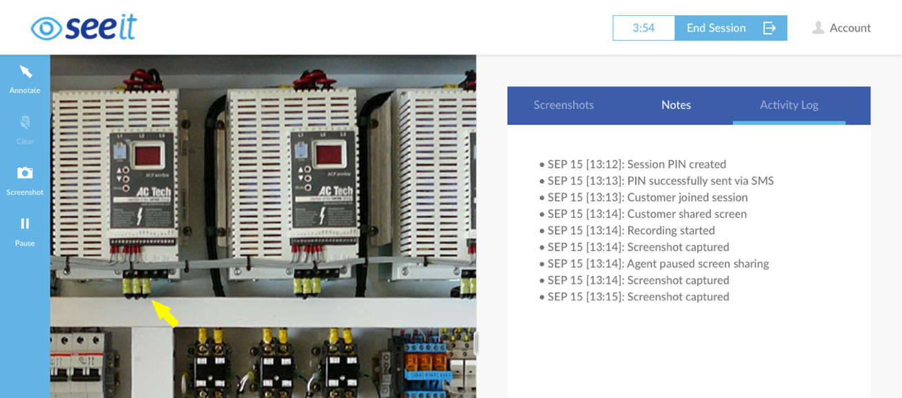
Seeit 2.0 is a combination of two very similar products: Rescue Lens (by LogMeIn) and Seeit (by Citrix).
Rescue Lens was a 2012 hackathon-project-turned-feature, and the original Seeit was a Citrix product designed to solve the same problems around the same time. LogMeIn and Citrix merged in 2017 and, due to low usage on a few nearly identical offerings, teams were formed to combine the products.
It's worth noting that, at their inception, web based real-time communication (webRTC) was not as developed and widespread as it is today. Both of these products were innovative for their time and continue to find success in niche markets.
The following is how my manager, Erin, and I influenced the development and combination of these products.
Given the daunting task of combining two products into a single offering, while simultaneously testing the market demand and perceived value of the product, Erin and I knew our first step would be user research. Luckily, since both Lens and Seeit have existing customers, we were able to coordinate site visits to customer facilities to learn from them firsthand.
Before we set out to visit customers, we defined the following goals for ourselves:
By the end of our initial research phase, we visited 4 customer sites, completed 20 interviews, and ran 12 collaborative activities with users.
Based on our research goals, we set up each site visit to include a tour of the facilities, interviews with a team managers about the buying process, and activities with support agents to discuss their daily routine. For a few of the visits we were also able to listen in on support calls with real customers.
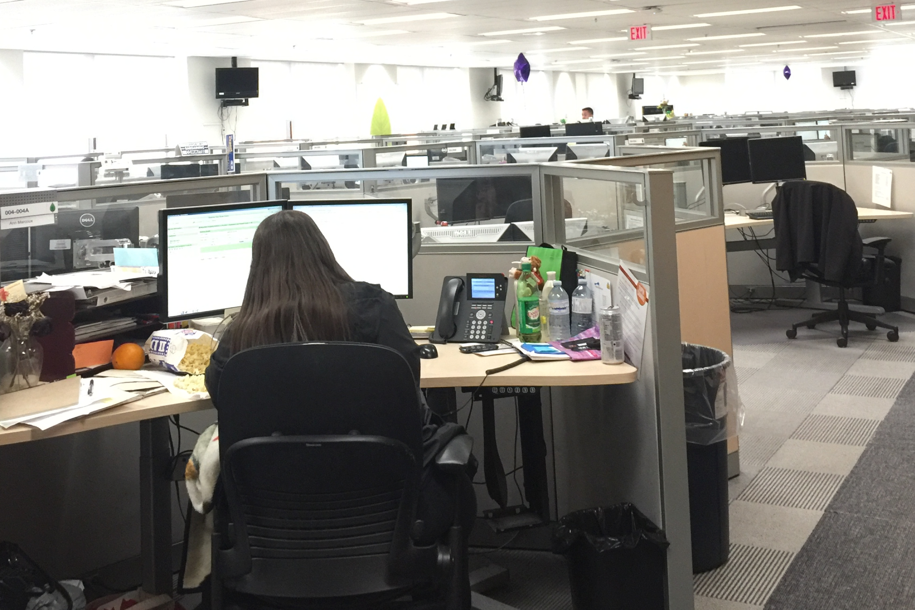
The call center of a customer we visited in Edmonton Canada.
On-site with customers, we conducted interviews with support managers to better understand their experiences and challenges. Our interviews primarily revolved around the discovery, research, buying, and onboarding processes involved in adopting Lens or Seeit.
For our collaborative activity, we asked support agents to walk us through a typical day as we noted the actions, people, tools, and emotions on sticky notes. These would later provide the basis our our support agent's journey map.
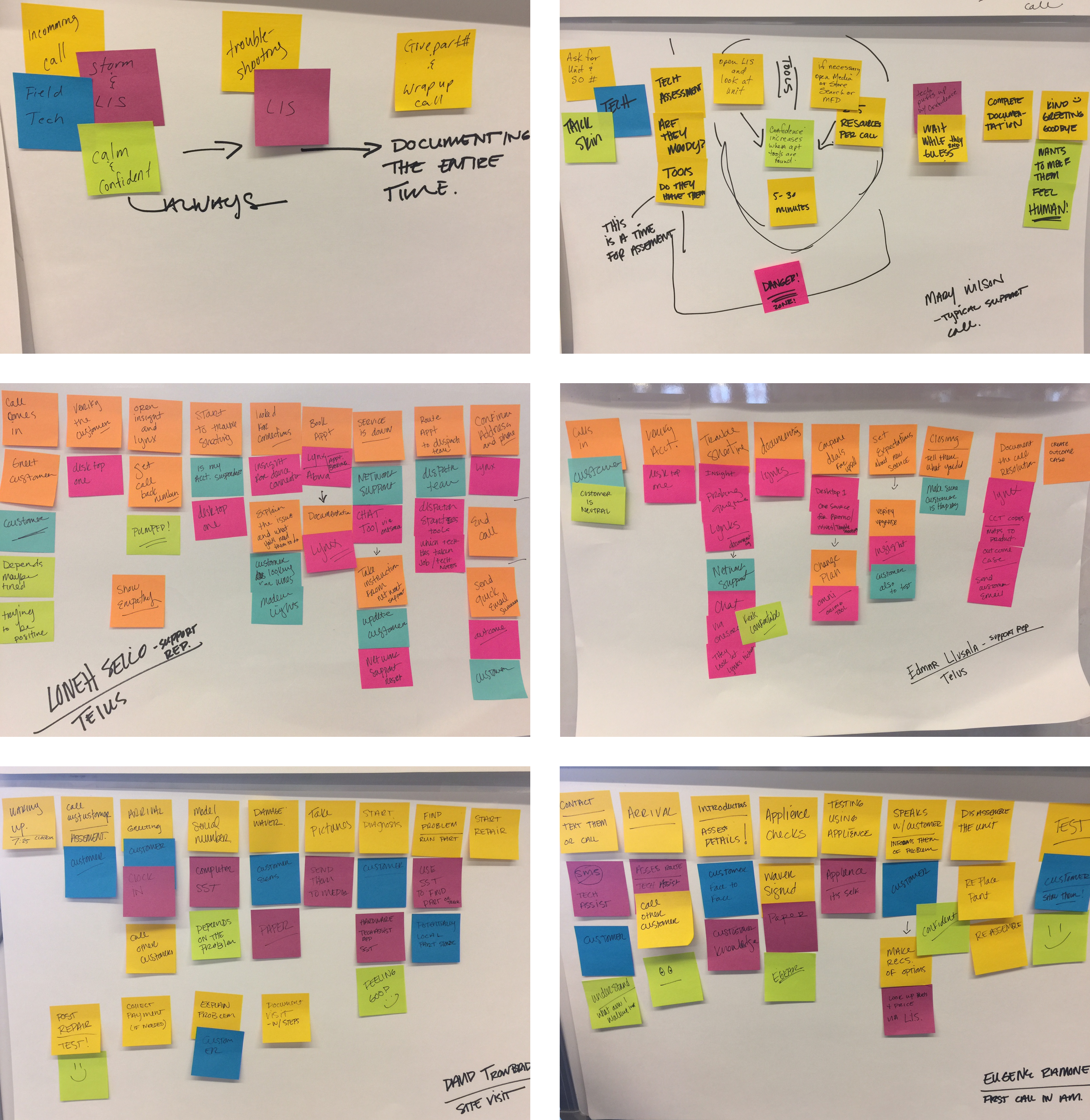
Diagrams of our support agents' daily routines, captured on-site during interviews.
When we returned to our office, Erin and I drafted a high-level findings report to share internally. This report included factual information about the companies, their industries, sizes, and processes, but also focused on the emotional aspects of providing daily support with our software. Our goal was to share the individual experiences of our customers as well, in order to build empathy and a desire to solve their problems.
In an effort to humanize our findings, for each site visit we included the single most quintessential and characteristic quote we heard. My personal favorite came from a field tech manager named Joe who, when asked to describe his job as a support technician, said:
"We provide precision guess work, based on unreliable data, provided by those of questionable knowledge."
Seemingly insignificant, this quote accurately described the outlook of many support agent users and highlighted the potential value of products like Lens and Seeit, that allow agents to actually see their customer's problems firsthand.
We included additional technical information gathered from support managers about their budgets, timelines, rollout strategies, and key performance indicators (KPIs) as well. We noted all of the tools our customers used, any bugs they reported, and any product misunderstandings we observed.
These granular findings helped us build a roadmap of enhancements that addressed immediate and long-term customer problems, so that each release made a measurable impact for our users.
Finally, we included general findings that would apply to various departments or individuals working on Lens or Seeit, like:
These were intended to be overarching themes that could influence a variety of projects across the organization.
With direct feedback from buyers, we decided to revise the trial flow to reduce the number of steps and challenges involved in the evaluation process.
We began the experiment by mapping out the existing flows for both Lens and Seeit, and then identified any unnecessary or blocking steps in the flows to remove. Our new experience streamlined the process between submitting the trial form and initiating their first session, to help quickly demonstrate the value of the product.
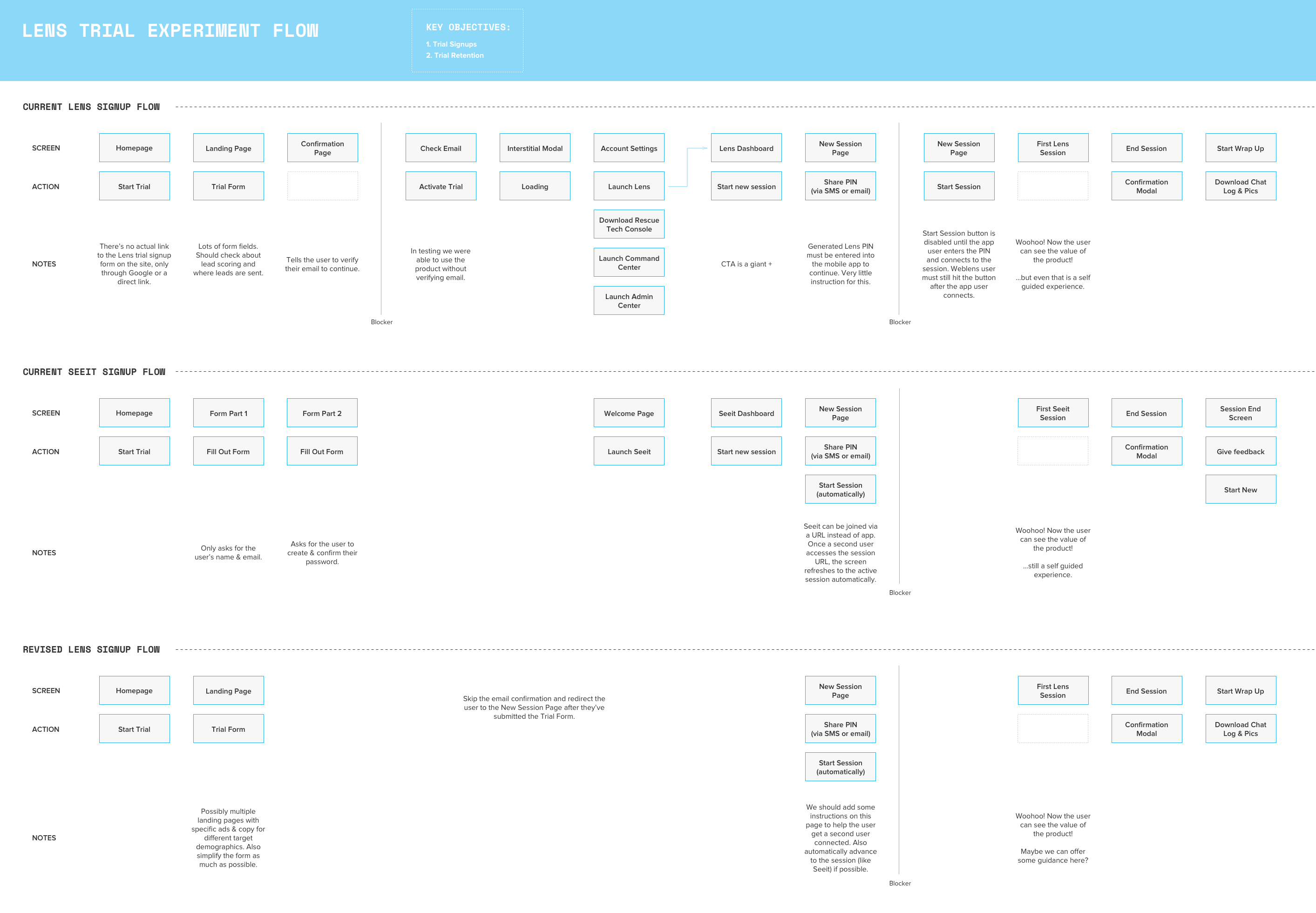
Our new trial flow minimized time to the user's first "Aha" moment.
We created a new landing page that highlighted the features and values we heard were most important to buyers. We also addressed our buyer's concern of needing to convince other stakeholders by creating an explainer video to share.
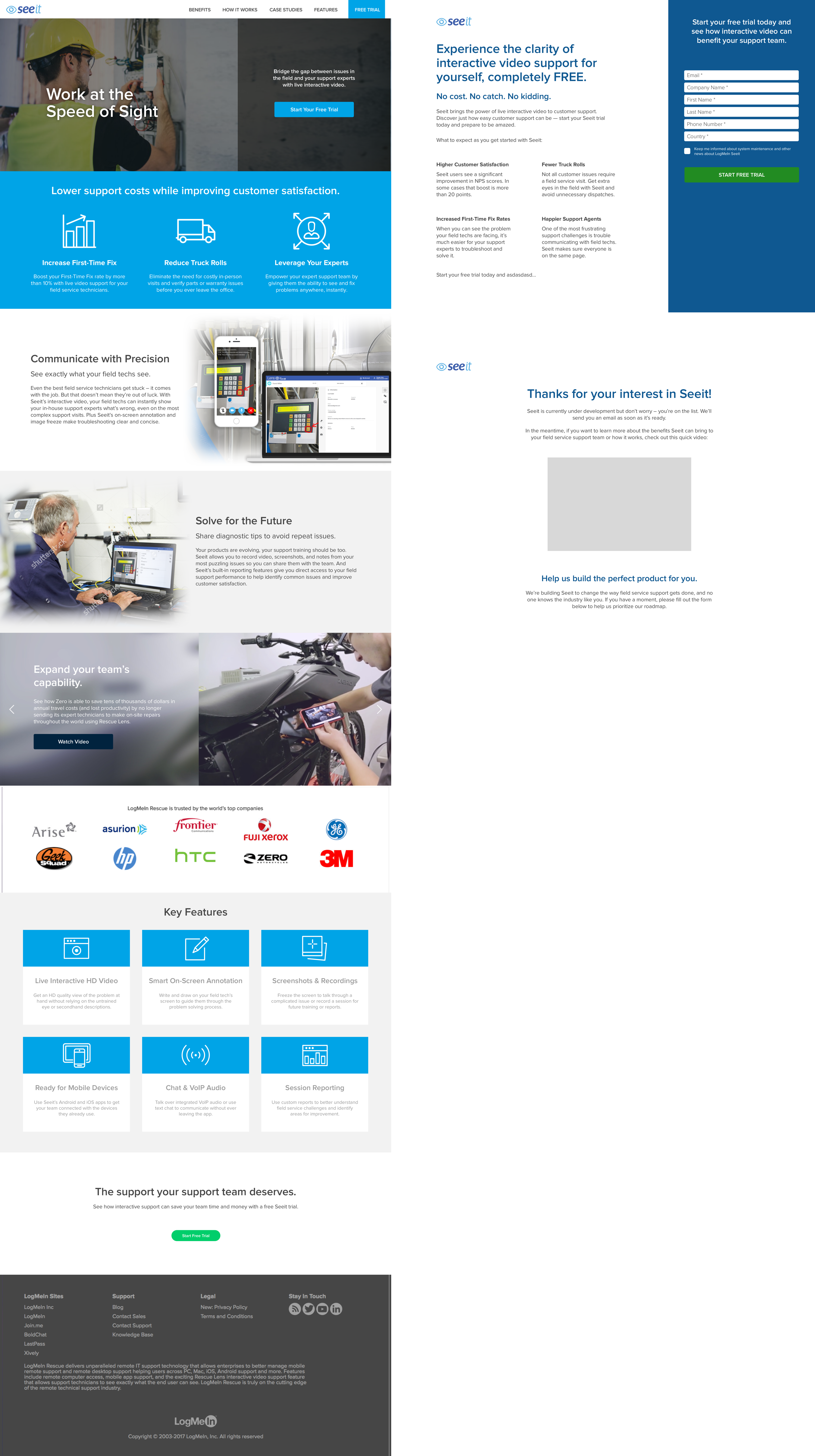
While we directed traffic to the trial flow experiment and gathered data, Erin and I began designing the new product flows and interfaces.
Previously in Lens, a customer needed to download an app to their smartphone before the agent could connect. In our interviews we heard that this was major point of friction, especially among older customers that weren't sure how to use the app stores. This often meant the agent would need to walk them through the process and, frequently, ended with a frustrated customer giving up on Lens entirely.
So for our new interface we decided to connect agents and customers in the browser, taking advantage of its ability to access the phones mic and camera. With this revised process, agents simply needed send a link to the customer (via text or email) and they could connect without additional hassle.
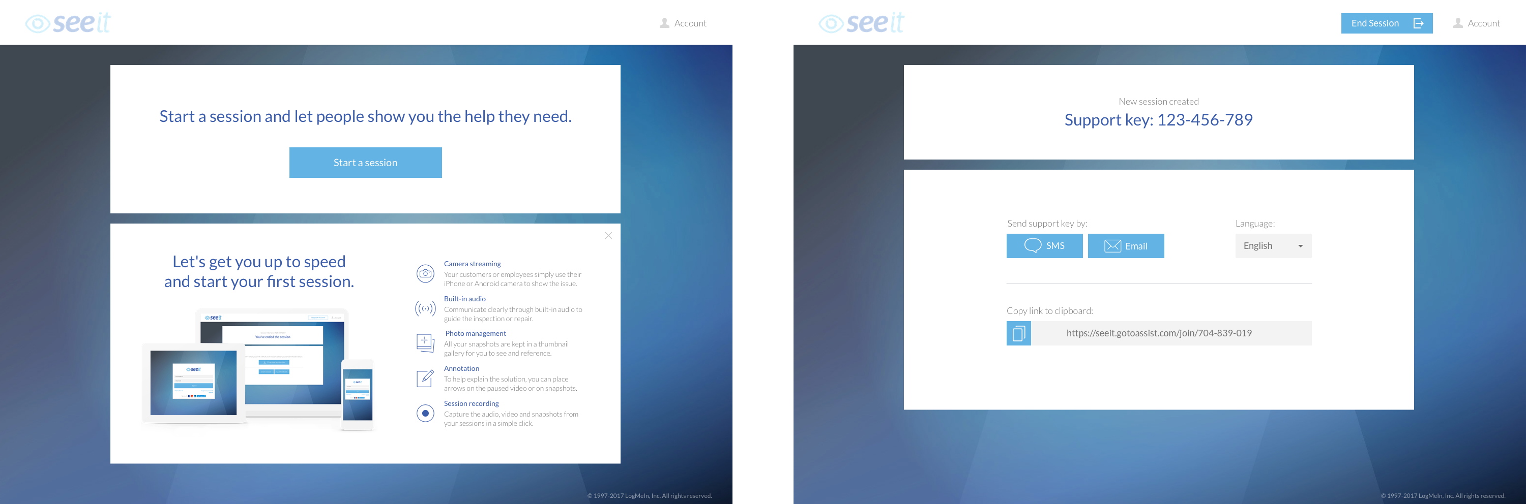
The redesigned connection experience focused on ease of use, especially for link sharing.
Once the agent and user were connected, the agent interface focused on two core tasks: seeing through the customer's camera and documenting the process. We found in interviews that capturing screenshots and notes were critical for sharing knowledge and tracking hardware issues, so these features are most pronounced. A sidebar on the left gave users quick access to the camera controls while space on the right was dedicated to managing screenshots, taking notes, and a system activity log.
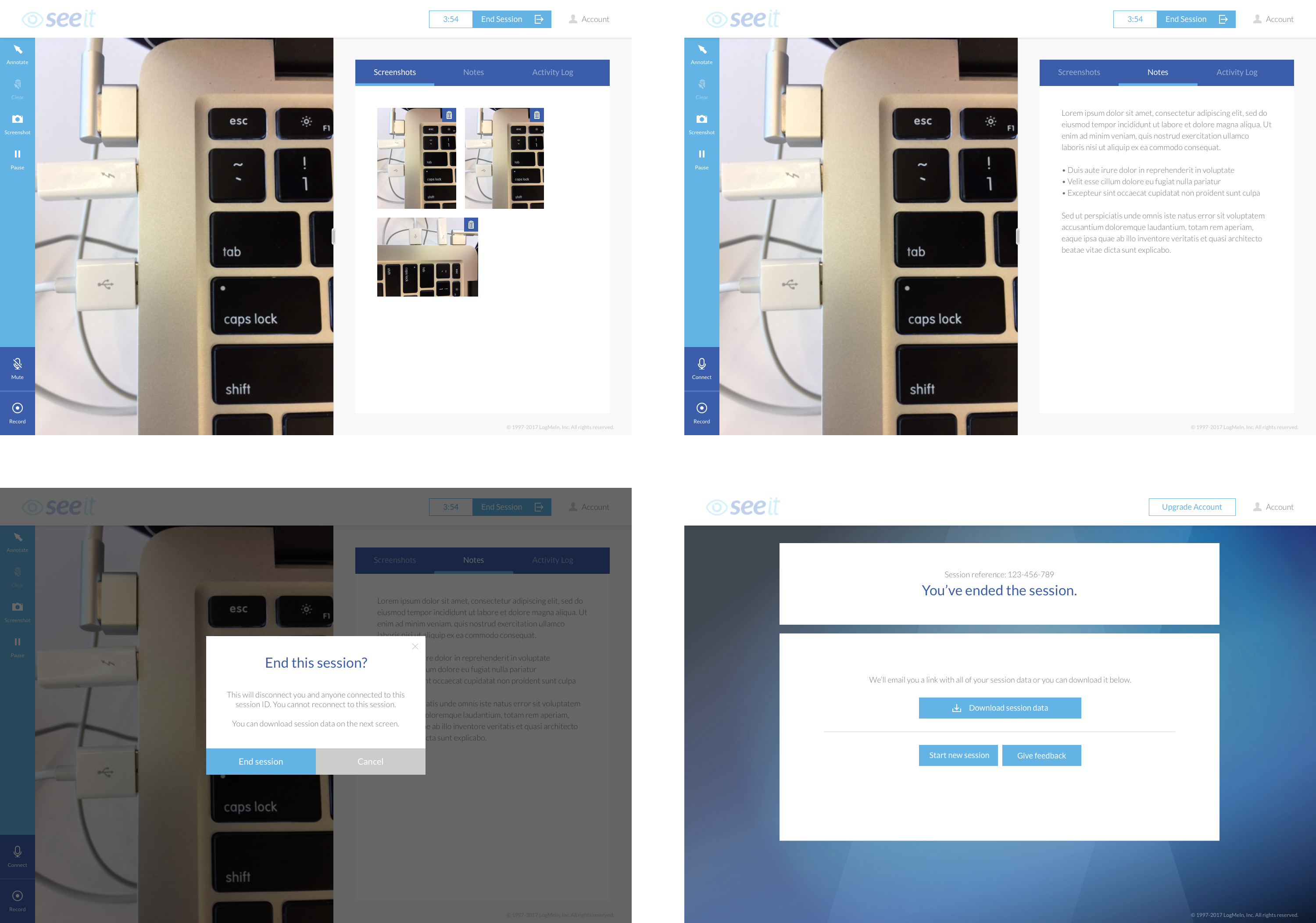
We also redesigned the customer interface to align with the brand and functionality of the new product. Here we tried to keep both the connection process and post-connection experience as simple and straightforward as possible.
For connections, if the customer received a text or email they could simply click the link and the browser would open to the right page with a prefilled support key. However, since agents were usually already talking to the customer on the phone when they initiated the support session, we included a manual entry point as well.
We also addressed customer's privacy concerns by including our privacy policy disclaimer before the session and displaying notifications to the customer whenever the agent took an action (eg: capturing screenshots or connecting to audio).
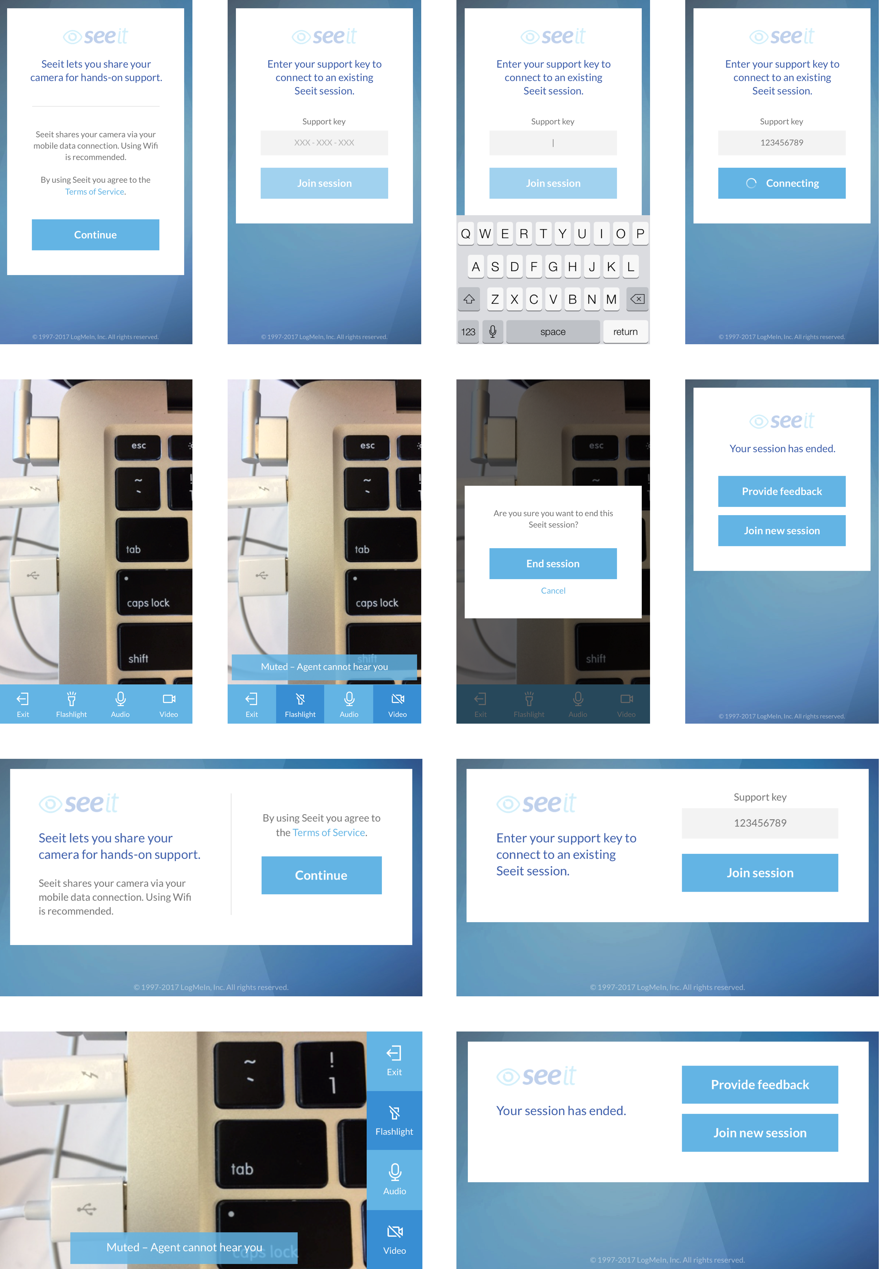
The simplifed customer interface with both portrait and landscape options.
After a couple months of development, the redesigned Seeit was ready to launch. Our ecommerce team redirected both existing product signup pages to the our improved trial flow and all net new customers received the new interfaces. Over a few months, we migrated all of the existing Lens and Seeit customers to the new product as well.
This was a critical success as it meant we no longer needed to maintain or provide support for multiple products.
With our new product released and all existing users migrated, our design work was largely finished. Erin and I continued to support the engineering team with minor tasks and enhancements over the following few months but have since moved to different products entirely.
While this project was shorter and more limited in scope than other products I've worked on, I found the research process extremely valuable. The experience of visiting actual customers in their environment and talking about their interactions with your product is humbling and I highly recommend any product designer should try it.
I think many designers have an idealized version of their target customer – working in perfect conditions without the regular challenges of daily life – and we design for that persona. However, seeing our actual customers working in crowded call centers and dedicated "support rooms" forced me to reevaluate what I thought I knew about our users. This firsthand knowledge helped me understand how seemingly insignificant factors played a major role in our users' success and helped me empathize with our users unlike anything I'd experienced before.
Thanks for checking out this case study. If you have any questions or feedback, feel free to send me a message.
Quick disclaimer: This is a professional project done while employed at LogMeIn. As such, some information is confidential and has been purposely omitted.